Blue Cross Blue Shield provider portal
How might we simplify and streamline the provider intake experience for the provider team?
About the project
The provider team at BCBS relied on a provider portal to record and manage practitioner data. However, the system's complex workflows led to inefficiencies and indicators of low data quality, such as incomplete or inconsistent entries. I collaborated closely with our design team to simplify and streamline the provider intake portal.
Role
Designer
Duration
Sep - Oct 2024
Impact
-Contributed to the redesign of simplified workflows that could reduce task completion time for the provider team, paving the way for future development phases
-Refined early concepts to explore potential solutions that served as the foundation for later design decisions.
Current state user journey
As part of our UX design process, we focus on understanding the current user journey to identify areas for improvement. Through discovery sessions and user research, our team pinpoints key pain points that users are facing when using the current system.

Key pain points:
1. Missed provider data
The team often receives incomplete provider data and has to follow up on missing information.
2. Cluttered information makes it challenging to find
Users have to go out of the main system to find the information they’re looking for in different places.
3. Users required to do repetitive, manual work
The same information is asked to be filled out repetitively in different systems.
The persona
Informed by our research findings, our team created a persona to embody the provider team. Through the persona ‘Andrea’, my team and I were able to empathize with her challenges and tailor the design to suit her needs and goals.

Research key findings
1. Current UI workflow is not aligned with business practice

2. Search is unnecessarily complicated for user's needs

3. Inability to edit provider data makes it difficult to recover from mistakes

The current workflow creates a need for intermediary copy and paste from source systems.
Users copy various data to sticky notes or other tools until they get to the place where the system asks for that information.
Colored dots show fields used by interview participants. Most of the fields were never really used.
If a mistake is made when editing a record, there is currently limited functionality to fix the mistake.
The data has to be marked as outdated and re-entered, which creates extra work.
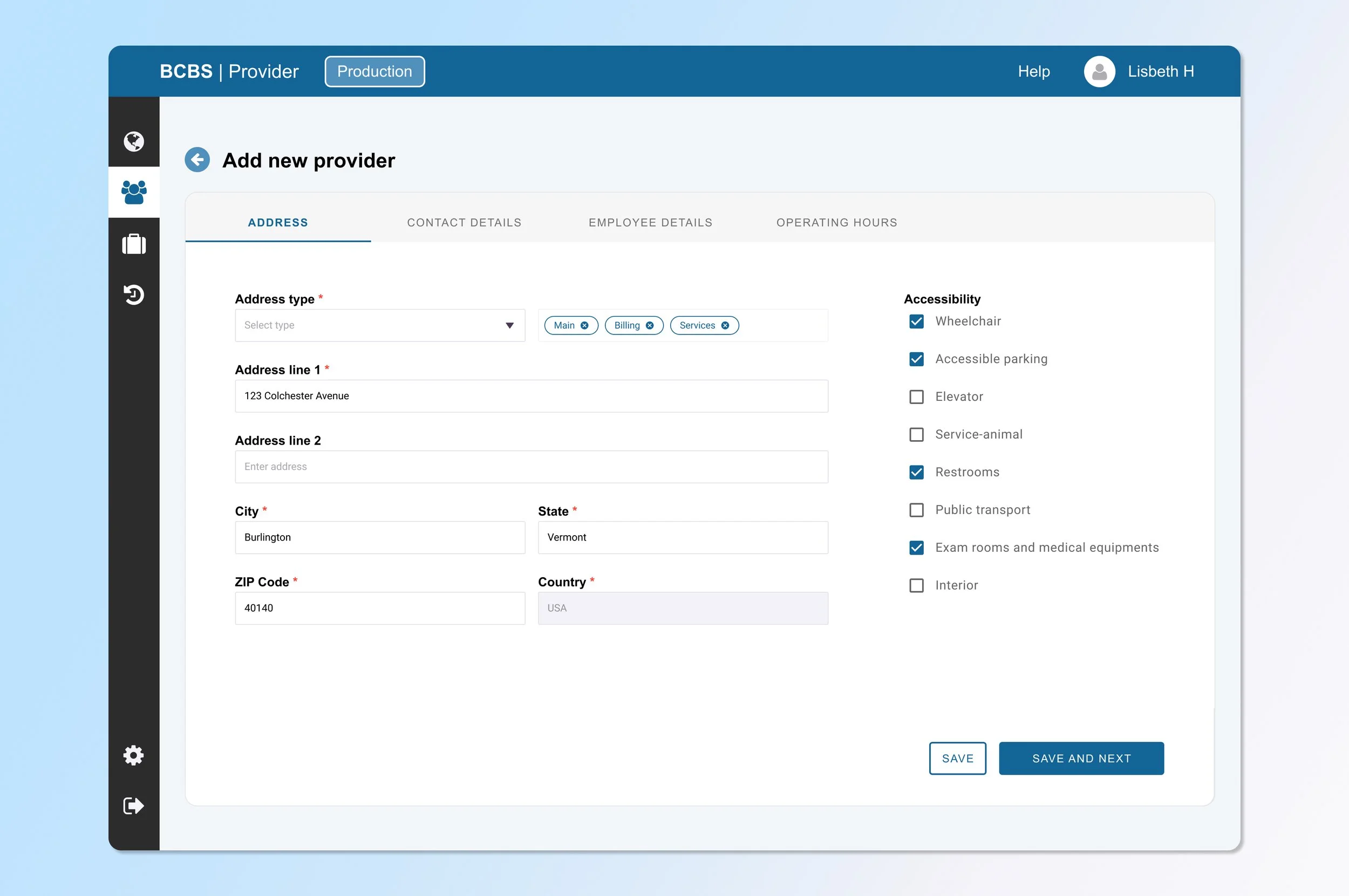
Low fidelity design
Based on insights and findings gathered during discovery, our design process begins with a clearer understanding of users’ needs and goals. At this first stage of design, we focused on structure and functionality and created simple wireframes to map out the user flow.

Mid fidelity design
Building on user feedback from the early low fidelity designs, we created the mid fidelity designs that brings more details to the wireframes. We refined the layout, added more interactions and colors to give a clearer sense of how the final product would look and feel.
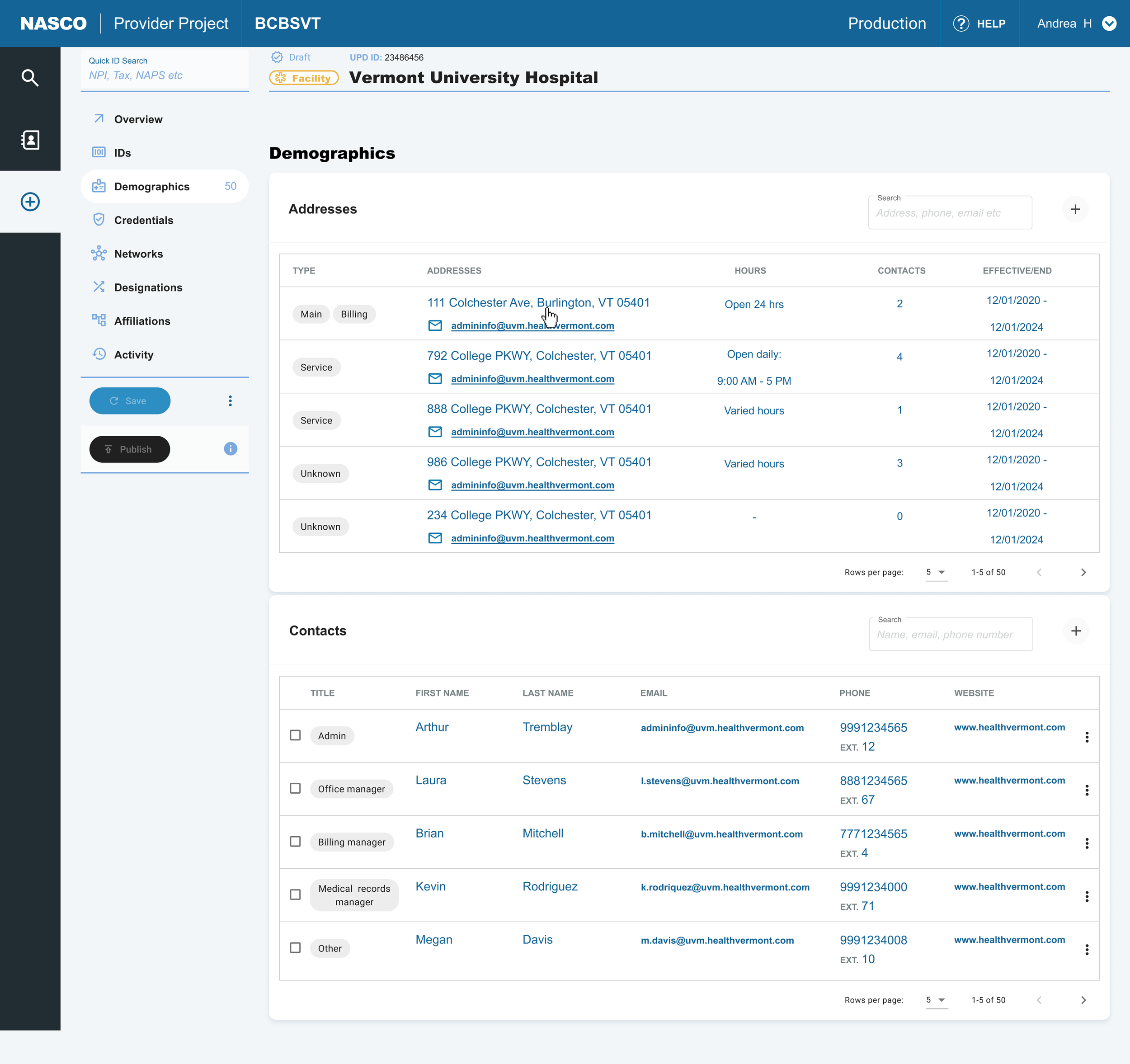


Final design
Based on test results and feedback from stakeholders, we’ve finalized the design for the new provider portal. This design will be launched as an MVP, and we’ll continue to track the success of the improvements and improve on them over time.
1. Clear categorization and grouping

2. Contact adding made easier by reduced copy pasting

3. Real time update and quick feedback

Anticipated results:
By organizing provider information into logical categories and providing search filters, users can easily narrow down their search, reducing the time it takes to find relevant results.
Anticipated results:
By allowing administrators to add contacts from a central source instead of manually creating them for each location, users save time and reduce duplicate data.
Anticipated results:
By removing the need to mark data as outdated before editing, users can make changes in real-time. They’ll also get instant inline validation if there’s an error before saving.
Design system
The development of this project will use the Angular framework, and our design system uses the Material 3 library, with custom adjustments made to the graphical elements to align with BCBS style guides.
